Brand Identity Development
When MV was called upon to design a new brand identity to reflect the values and personality of a new start up consultancy in the energy industry, the team switched on immediately.

We developed a brief with our client which included a logotype design specification as follows:
Logostyle that can be used in all formats including online, website, emails, social media, presentations (powerpoint etc), print, and business stationery.
Main business objective – Helping bring cleantech new energy propositions to clients.
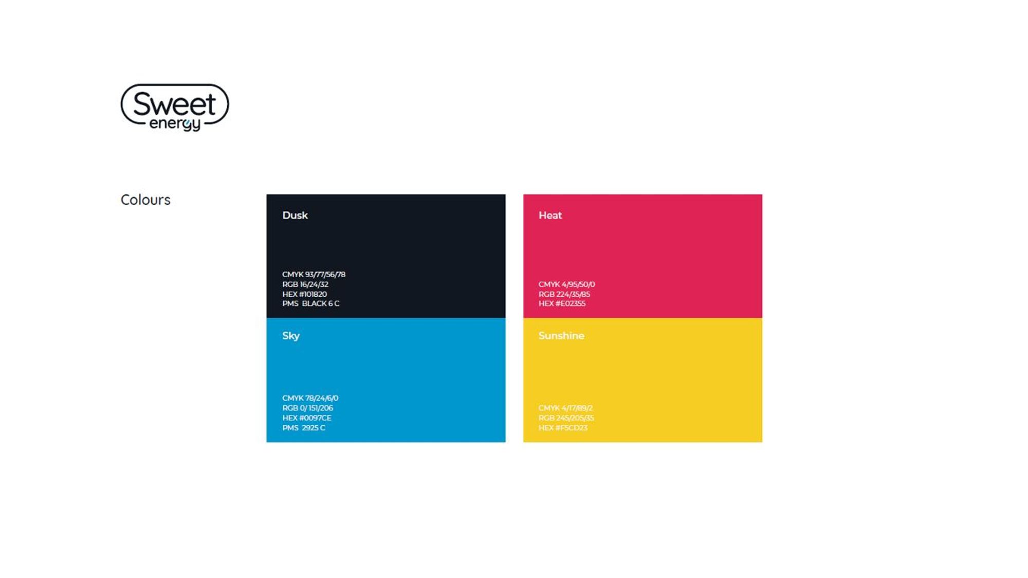
Use primary colours and feature company name 'Sweet Energy'
Key words that represent business ‘DNA’.
Empowerment (empowering people to take control of their energy usage, lowering carbon), E-mobility, Cleantech.
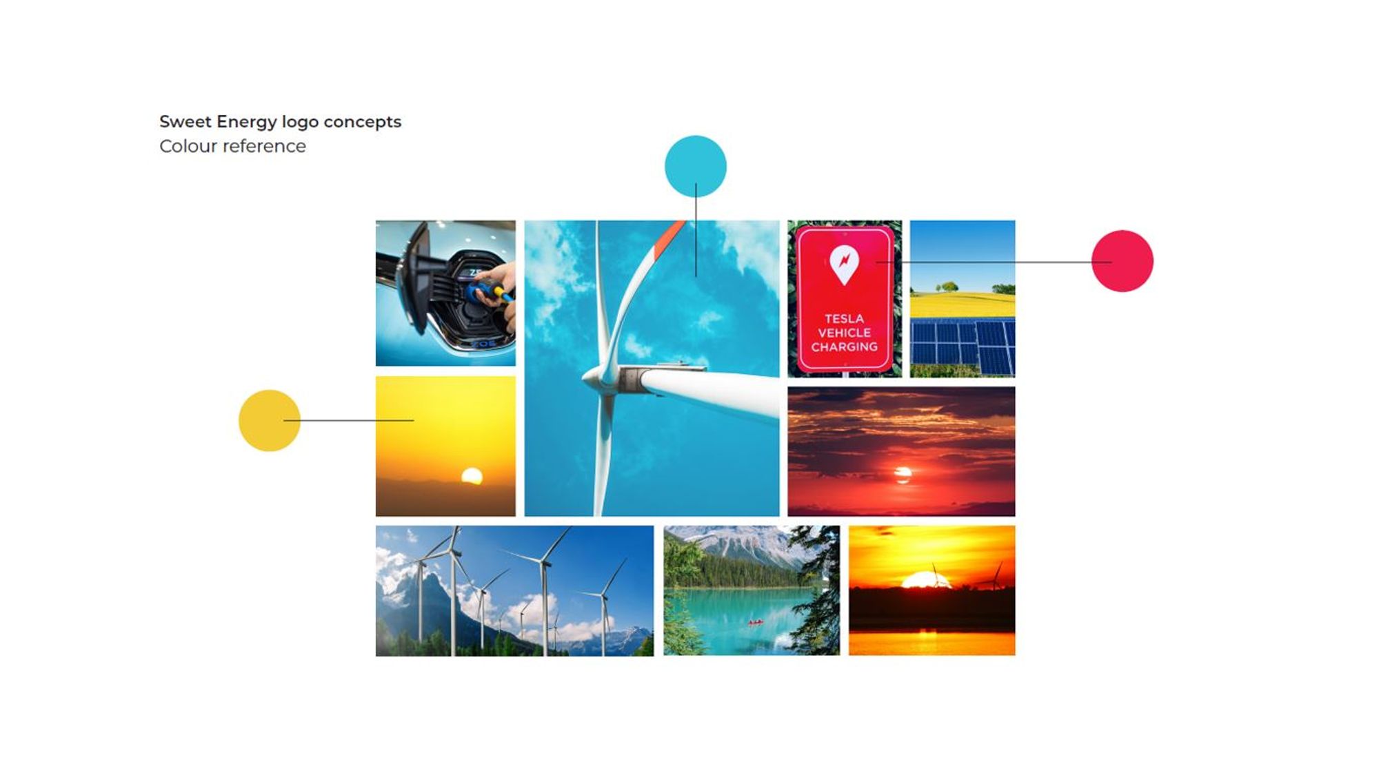
We produced a series of design concepts inspired by renewable energy themes, the natural environment and the key words.
The concepts featured a number of font and colour options reflecting the energy market and clean technology, together with clever character conversions.
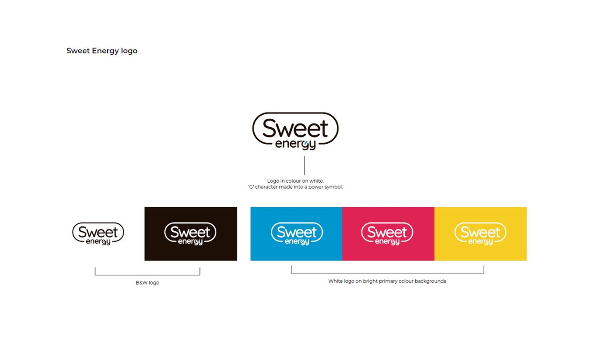
The main preferred theme used the simplicity of a sweet lozenge shape that surrounds the name Sweet Energy, which equally represents self empowerment and a clear clean design.
The converted the 'G' character into a power symbol, provides a reinforcing link to the industry, and acts as a symbol of the key component the business provides as the driver to success of their clients.

Get in
Touch
- 01908 223 214
- ideas@murphyvarley.com
- 6 Manor Farm Court, Old Wolverton, Milton Keynes MK12 5NN